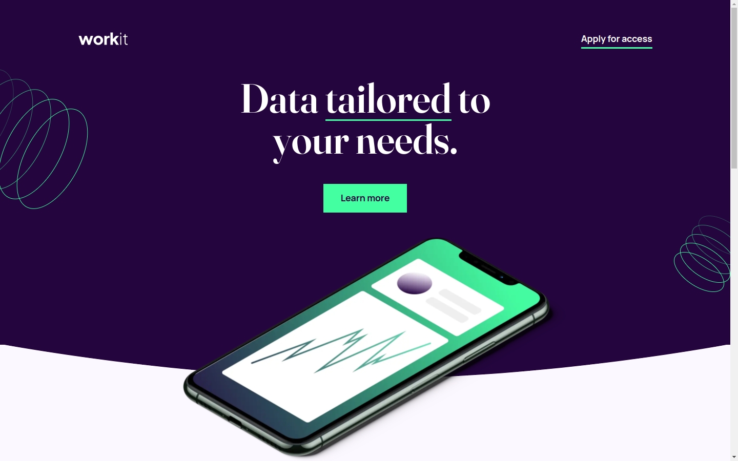
Workit landing page
A fully-responsive mock landing page using fluid type and spacing, featuring Utopia.
Highlights
Fluid type and space thanks to Utopia
Responsive design that looks good on desktop, tablet, and mobile with only 2 media queries
CUBE CSS with Tailwind and design tokens
Built with
Eleventy
Tailwind
CUBE CSS
Semantic HTML5 markup
CSS custom properties
Flexbox
Mobile-first workflow
Why I built this
I have been taking challenges on Frontend Mentor to get better at translating design mockups into code.
I also wanted to try working with Tailwind in a project, and this design seemed like a good fit.
Why I avoided Tailwind in the past
One concept that stuck to me early on while learning how to code is the separation of concerns. In the context of web development, this means that HTML is responsible for content and giving it structure, while CSS is responsible for styling and layout concerns. In other words, HTML is the skeleton, while CSS is the skin.
So when I first encountered Tailwind and its infamous tagline “Best practices” don’t actually work, I was convinced it wasn’t for me.
But later on I realized that separation of concerns is more than just keeping CSS out of HTML. In fact, Adam Wathan, the creator of Tailwind CSS, makes a lot of good points in his his article CSS Utility Classes and “Separation of Concerns”. I think a huge misconception about Tailwind is that you’re just supposed to plug it in your project and you never have to make a CSS file, just litter your HTML with classes. But that is a utility-only approach, not utility-first which is how Tailwind was intended to be used.
When I stumbled upon Andy Bell’s Build Excellent Websites, which mentions and uses Tailwind, that’s when I decided to give it a try. And I realized, hey, this isn’t so bad!
Project notes
I used Tailwind quite conservatively in conjunction with CUBE CSS, which means I still wrote component-based classes instead of taking a utility-first approach. But I definitely see the benefit of using Tailwind, especially for rapid UI development during the early phases of a project. I especially like how it can process design tokens and convert them into CSS custom properties that I can use in my code.
The source code of Build Excellent Websites is my primary inspiration for this project. I tried my best to practice the principles in that site, which is why I only used 2 media queries for this solution (not counting the ones in resets and config files). The rest of the layout are handled by utility classes, such as the Switcher a.k.a. the Flexbox Holy Albatross by Heydon Pickering.
I also gained more confidence working with SVG:
- For the logos, I used inline SVG in the header and footer instead of
<img>tags. - I combined the social media icons into an icon sprite embedded in the page, which avoids extra HTTP requests.